
Types of Maps
Reference
Thematic
Thematic Maps
choropleth
dot density
graduated symbol
isoline
cartogram
flowline
Projections
Mercator
Goode Homolosine
Robinson
Winkel
Gall-Peters
Spatial Concepts
absolute location/distance
relative location/distance
scale

Introduction to your new way of thinking
When I tell people I teach human geography, I always get the same reaction: “What is that?” I love that reaction. It means I’m starting with a blank slate. Everyone knows history, math, and biology; and we’ve formed opinions about those subjects, whether we love or hate them. But most approach human geography with curiosity and haven’t formed an opinion about it yet.
So, what is human geography?
The word geography suggests countries, continents, and maps. That’s somewhat true, but it is only a small part of the subject and doesn’t come close to describing what the course is about.
In world history, I taught students how we can understand our present world and the challenges we face by understanding our past. It provides a worldview, meaning a way to understand the world.
All subjects do this. A science teacher could explain to you how climate change is driving political unrest and war in Syria, where a drought caused food prices to skyrocket. An English teacher uses the written language to understand the human condition. Despite my math anxiety and poor relationship with the subject, I’ll admit nothing about our modern lives would be possible without it.
This is why you have to take all these classes; they lay a foundation for your worldview.
What’s different about human geography is that we borrow a little from all the above.
We will examine how climate shapes culture, how a population’s way of life is driven by how hot or cold, wet or dry their homeland is. How biotechnology is driving population growth, and math can accurately predict when a country’s population growth will reach a point where it stops increasing. We’ll examine the role that political stability plays in a country’s economy, and how gender equality and education for girls sets off a chain reaction that leads to economic development and eradication of poverty.
In human geography we learn about the world today to understand the world of your future. And by the end of this course, you won’t just understand the world better, you’ll have a better idea of what the world will look like in the year 2100.
Maps
Cartography is the academic field of creating maps, and we will borrow from it often because they offer such a powerful tool for telling a story or understanding a circumstance.
Reference Maps and Map Projections
The most common perception of a map is probably a reference map of the world. Reference maps tells the story of your surroundings. So a map of Watsonville High School would be a large-scale reference map.
Map Scale
We’ll stop here for a second to understand scale. It can be confusing. Every map represents a portion of the Earth’s surface. If you imagine a satellite or drone camera, scale will refer to how far you zoom in.
When you start with an image zoomed all the way out, and can see the world from space, you’re looking at a small-scale map. At this scale, wouldn’t be able to see enough detail to make out the location of Watsonville. But as you zoom in, details become larger. The more you zoom in, the larger those details become (large-scale).
The part that gets confusing is this: a small scale map shows a large area of the Earth’s surface, and a large scale map displays a small area of the Earth’s surface. That is how most textbooks explain it, and that is exactly why you have this website instead. So if you just got confused again, read my explanation above again, and use these maps below to practice spotting the difference.


Maps, Location, and Distance
relative location & distance vs absolute location & distance
We generally use reference maps to display or convey location and distance. When you go to a theme park, you will always find reference maps with some kind of you are here point, telling you where you are relative to your surroundings.
Humans generally use relative location when we explain where things are. If I told you it’s the building between the main building where my classroom is and the old gym, would you know which location I just described?
I grew up in Rohnert Park, a small town about 45 minutes north of San Francisco and south of Santa Rosa. My description includes a relative location; it uses two other locations to describe where Rohnert Park is, as well as relative distance–45 minutes north of San Francisco. 45 mins is if there is no traffic and you’re driving at an average speed. I can easily make it in 30 minutes because I love driving fast on the freeway, but I’ve also been stuck in traffic for over 2 hours. If I were traveling by bus, it would take longer than 45 minutes, and if I was walking, it would take much longer. That’s relative distance.
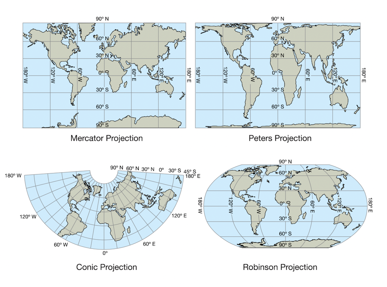
Map Projections
When we want to create the smallest scale map, one that displays the entire world, we run into some problems. None of the maps we see show what the world, Earth, actually looks like. Every map you have seen in your life is lying to you. Here’s why
Uninterrupted Maps
These maps are uninterrupted, meaning they are displayed flat, as one uninterrupted image. (this makes sense when you learn that there are interrupted maps)

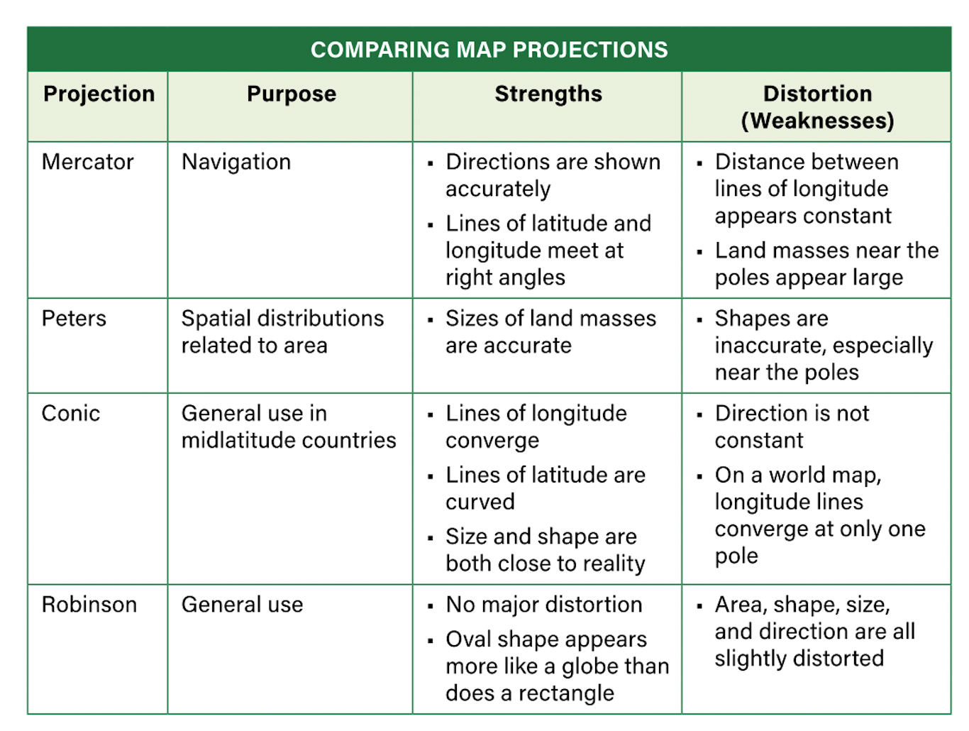
Mercator Projection
Probably the most widely known map. Great for navigating on the open sea with its straight lines for latitude and longitude–awful at showing the the size of land mass.

Gall-Peters
This projection looks like what happens when you stretch an image. It is better at showing the actual size but horrible at displaying distance.

Robinson & Winkle Projection
Both have distortion at the poles, but make better attempts at size, shape, and distance as they illustrates the roundness of the globe.
Interrupted Maps
These maps are interrupted, meaning there are “interruptions” in distance.
Goode Homolosine
Distorted poles, but better at size and shape, accomplished by essentially ripping what would be the oceans surrounding the land masses.

Fuller
Very “interrupted” but shows more accurate size of the land mass. Check out how small the U.S. is in comparison to the true size of Africa.

Thematic Maps
Thematic maps will be the maps most widely used in human geography. You will see them often, in every unit, and most likely every, or nearly every, chapter. These maps can tell an entire story or explain what or why something is happening. Because of this, you will grow to appreciate maps this year much more than you do now.
What makes these types of maps so powerful is their ability to display or convey data in a way that is quick and easy to analyze and draw conclusions.
For example, I could provide you with a table of average household salaries for every household in the United States and for every state and ask you to draw conclusions about poverty in America. That would be hundreds of pages of numbers, which could take you days to figure out. Or I could give you this:
Choropleth Map

This choropleth map displays that data so that you can quickly see which states have the highest poverty rates and which states have the least poverty.
This is a good time to start learning about what we call the scale of analysis. In the map above, the scale is national, meaning it shows the United States of America. The scale of analysis is at the state level, meaning the data portion of the map displays data by state.
When we change our scale of analysis, we can often see different patterns and learn amazing new things. Here’s an example of that same data, displayed by county for California.

This map’s scale is regional (at the state level) but the scale of analysis is local (at the county level)l. What we see in this map is data hidden in the national map with the regional scale of analysis (state-level).
In the choropleth map below, we see a national-scale map, with a scale of analysis at the local scale (counties) displaying one-bedroom rental prices. Think of how confusing this would be if we didn’t have this map, and instead just had a long list of numbers. Maps help us visualize data, analyze it, draw conclusions, and make important decisions as we’ll see in our next chapter.

Dot Distribution Map
The map below shows the distribution patterns of U.S. public libraries. This map is a good place to teach distribution patterns, a pretty obvious concept you’ve probably already learned on your own without realizing it’s human geography.
Clustered distribution pattern: Look at those clusters of dots that almost form circles. There’s a pretty obvious one in the northern half of Texas.
Linear distribution: Look for dots that form lines. You can see some of these in Central California following our major highways that connect Southern California to the rest of the state.
Dispersed distribution: These patterns look nearly equally dispersed. States like Montana and Wyoming are a couple of examples.

Graduated Symbol Map
These maps display data using symbols of different sizes. The example below uses a circle symbol, and the data it displays is population by county. We don’t see the outline of those counties on the map, but we know the data is coming from those counties based on the key. Study this map for a bit and consider all the different conclusions you can make.

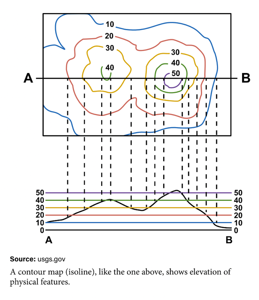
Isoline Maps
These maps can look confusing, but they’re often used to display weather patters.

Isoline maps can also show elevation, which means how high a location is relative to “sea level.” The size of the circle indicates elevation. If you picture two mountains next to each other, with the mountain on the right being taller, you can make sense of this elevation map below.
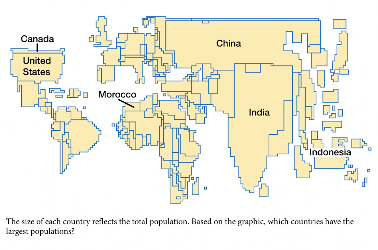
Cartogram Maps
Cartogram maps use size and distortion to convey data. The point of a cartogram map is not to be accurate with the size, shape, or location of countries; instead, it almost turns countries into balloons to illustrate a point. In this map, we can see that Australia has a lot of organic agriculture, but the image on the map looks nothing like the country; in this case, it’s bloated to the point where it looks like a circle.

Sometimes a cartogram map uses boxy pixilated shapes for countries like the one below.
Flow Maps
Flow maps are great because they can tell stories using data and movement. The flow map below shows world migration since 1500. Imagine what this flow map would look like if the time period were between the year 2000 and today.
